To colour with alchol markers is definitely quite different than tanling. To start it is wise to check the tips from the Spectrum Noir site http://spectrumnoir.com and view the videos. The tips are films of about 8 to 10 minutes which explains and shows a certain colouring technique.
Tot nu toe had ik de kleuren altijd 'gewoon' naast elkaar gebruikt, zoals ik met gewone viltstiften altijd kleurplaten inkleurde. Maar met de Spectrum Noir markers kun je nog veel meer doen dan eenvoudig kleuren!
So far I used the colours in an orinary manner, putting them next to eachother like I used to with ordinary felt pens colouring templates. But with the Spectrum Noir markers you can do a lot more than simply colouring.
Een aantal dingen zijn handig om te weten van de Spectrum Noir markers:
- ze zijn niet uitwasbaar, dus watervast en te gebruiken op heeeeeel veel verschillende materialen. Wel is het op glad materiaal te verwijderen met alcohol.
- ze zijn in 3 tot 11 tinten per kleur(-groep)
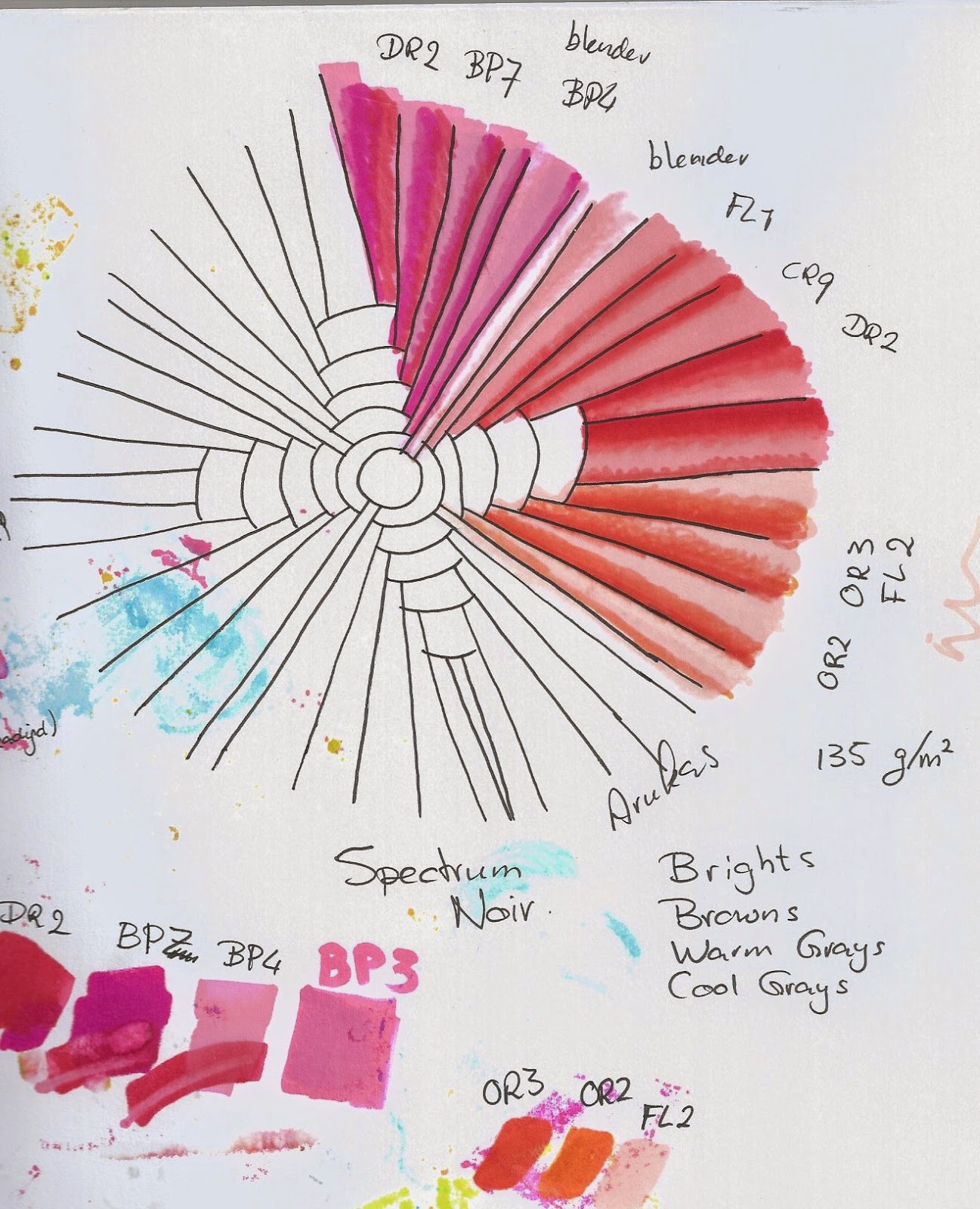
- er zijn 28 (!!) kleurgroepen, waarvan 4 grijzen, 3 bruinen, 5 met groenen, 4 met blauwen, 2 paarsen, 2 roze, 2 oranjes en 2 soorten met roden. En dan ben ik de 2 groepen met gelen vergeten. Degenen die meetellen missen nu alleen nog de zwarte en de kleurloze blender.
- de markers hebben een kogelpunt (voor de fijne lijnen) en een chisel punt (dit is een schuine blokvorm).
- de punten zijn ook te vervangen door een kwast-achtige vorm punt, de brush, vanaf de nieuwste generatie markers.
- dat je 3 keer over dezelfde plaats moeten kleuren om een verzadigde kleur te krijgen (vooral bij dikker papier). Dit is een egale kleur waarbij je niet meer ziet waar je met de 'viltstift' de strepen hebt gezet.
A few things come to mind using the Spectrum Noir markers:
- they are not washable and usable on many different materials. Though on very smooth surfaces removable with alcohol.
- they come in 3 up to 11 hues per colour (group)
- there are 28 (!!) colour groups, of which there are 4 kinds of grays, 3 browns, 5 with greens, 4 blues, 2 purples/violets, 2 pinks, 2 oranges and 2 kinds of reds. And then I forgot the 2 with yellows For anyone who is counting along, we now only miss the black and the colourless blender.
- the markers have double ends: one bullet nib (for fine lines) and a chisel nib.
- the nibs you replace with a brush nib, from the new 'next generation' markers.
- you have to colour a part 3 times to get a saturated colour (especially with thicker paper). This saturation gives a uniform colouring without seeing any stripes / streaks.
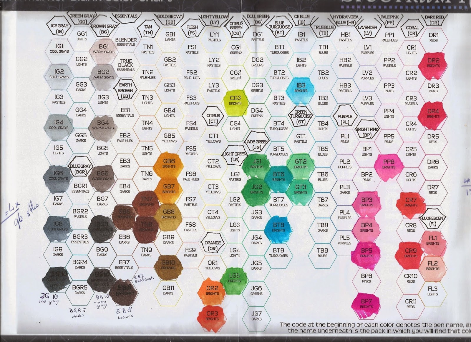
Op dit moment heb ik alleen de volgende kleuren in mijn bezit: Een serie van 24 Brights en sets van 6 IJsgrijzen, Warmgrijzen, 6 Bruinen en de blanco blender. Voor mijn eigen overzicht heb ik mijn markers gebruikt om een blanco kleurenkaart in te vullen.
Deze blanco kleurenkaart kun je in de Downloads-sectie van de Spectrum Noir-site downloaden.
At this moment I only have the following colours in my possession: A series of 24 Brights and sets of 6 Ice Grays, Warm Grays, 6 Browns and the colourless blender. For my own use I filled a blank marker overview with my colours. This blank colourchart you can download at 'downloads' on the Spectrum Noir site.
Degenen die me kennen weten dat ik met zoveel kleurtjes en een lading tips, flink aan het onderzoeken wil slaan. The persons who know me by now willl know that with this load of colours and tips, I will go and investigate.
Hieronder zie je de verschillende technieken Here you'll see the different techniques:
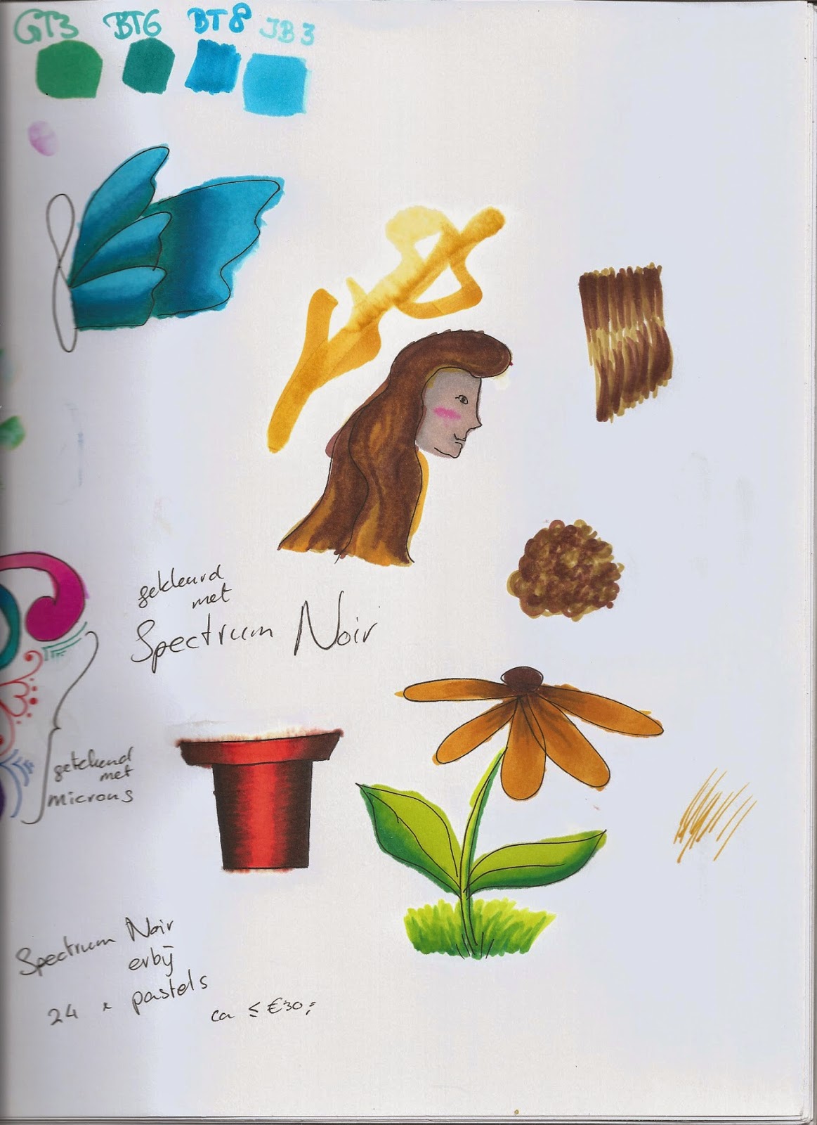 Naast het kleuren van verzadigde kleuren was de eerste techniek het kleuren van een overloop van verschillende markers uit éénzelfde kleurgroep, zodat het vloeiend van de ene kleur overloopt in de andere tint. Voor deze en de volgende technieken moet je altijd 'nat-op-nat'werken. Dit betekent dat je direct achterelkaar de verschillende kleuren over elkaar moet tekenen. Dit maakt dat de menging het mooist wordt met deze markers. Ook het maken van een lichtplek de zgn highlight werd belicht ;-) . Next to colour saturated colours the first technique was to colour with different hues of the same colour group to get a blend from light to dark. For this and the next techniques it is best to work 'wet on wet'. With this they mean to colour directly one colour over another colour. This makes the blending best. Also making a hightlight was explained
Voor de tweede techniek heb ik een 'haren'- filmpje bekeken: steile haren en krullen inkleuren. Alleen het kleuren van lange golvende haren is nog wel wat lastiger. Ik gebruikte voor de haren verschillende kleuren bruin uit mijn 'browns' set.
De volgende stap was de huid. Helaas heb ik (nog) geen pastel- en huidkleur-markers dus ik heb met de allerlichtste kleur van de bruin-grijzen gekleurd.
The second technique was about colouring hair: straight hair and curly hair. Only colouring curly long hair is quite an challenge I used different hues of brown from the set of Browns. The next step was the skin. Unfortunately I do not have (yet) the pastel and skintone markers so I coloured with the lightest hues of the brown (warm) grays.
Een derde techniek was het tekenen van een ronding door gebruik van verschillende kleurgroepen op een 'plat' getekende plantenpot.
 Hierna volgde het tekenen van lagen die door het kleurgebruik dichterbij en verder weg lijken. Dit deed ik in de (snel getekende) vlinder. A third technique was making something looking curved (3D) by using colours of different colourgroups on a 'flat' (2D) drawned pot. After this followed drawing layering which are made by using colours, making it look like nearer and further away. For this one I drew quite quickly a butterfly.
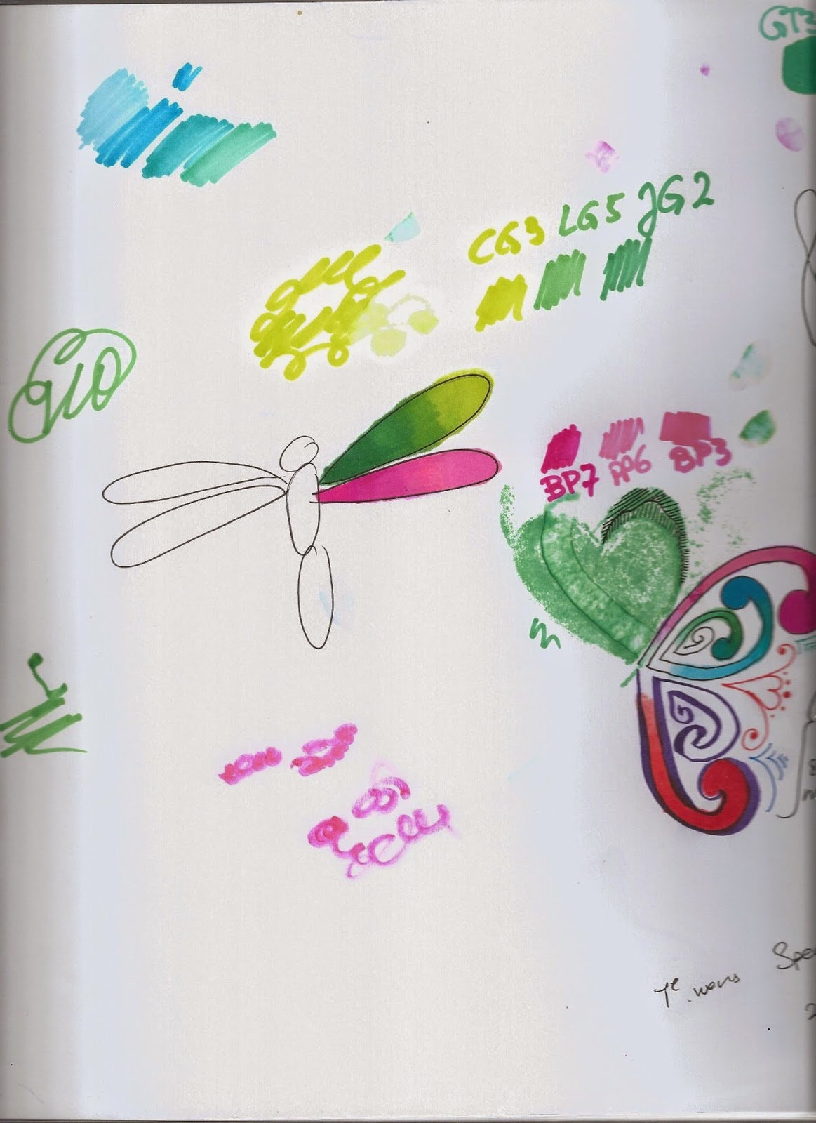
Met de libelle heb ik het kleuren met een palet geprobeerd. Je kleurt de donkere tinten van de te gebruiken marker-serie op een zeer glad plastic ondergrond (zoals overhead sheets). Met de lichtere kleur neem je de iets donkere kleur op op de punt en kleurt de donkere kleur met de lichte marker op het papier verder uit. Het eerste deel is dus donker en het wordt vanzelf lichter naar de eigen kleur van de marker. Dit heb ik met de groenen uitgeprobeerd en met de rozen.
With the dragonfly I tried colouring with a palet. You put the darkers hues on a very smooth piece of plastic (like a sheet). With a lighter hue you pick up the darker hue from the sheet and colour the darker hue on the paper which automatically will fade to the lighter colour from the marker. This I tried with the greens and the pinks.
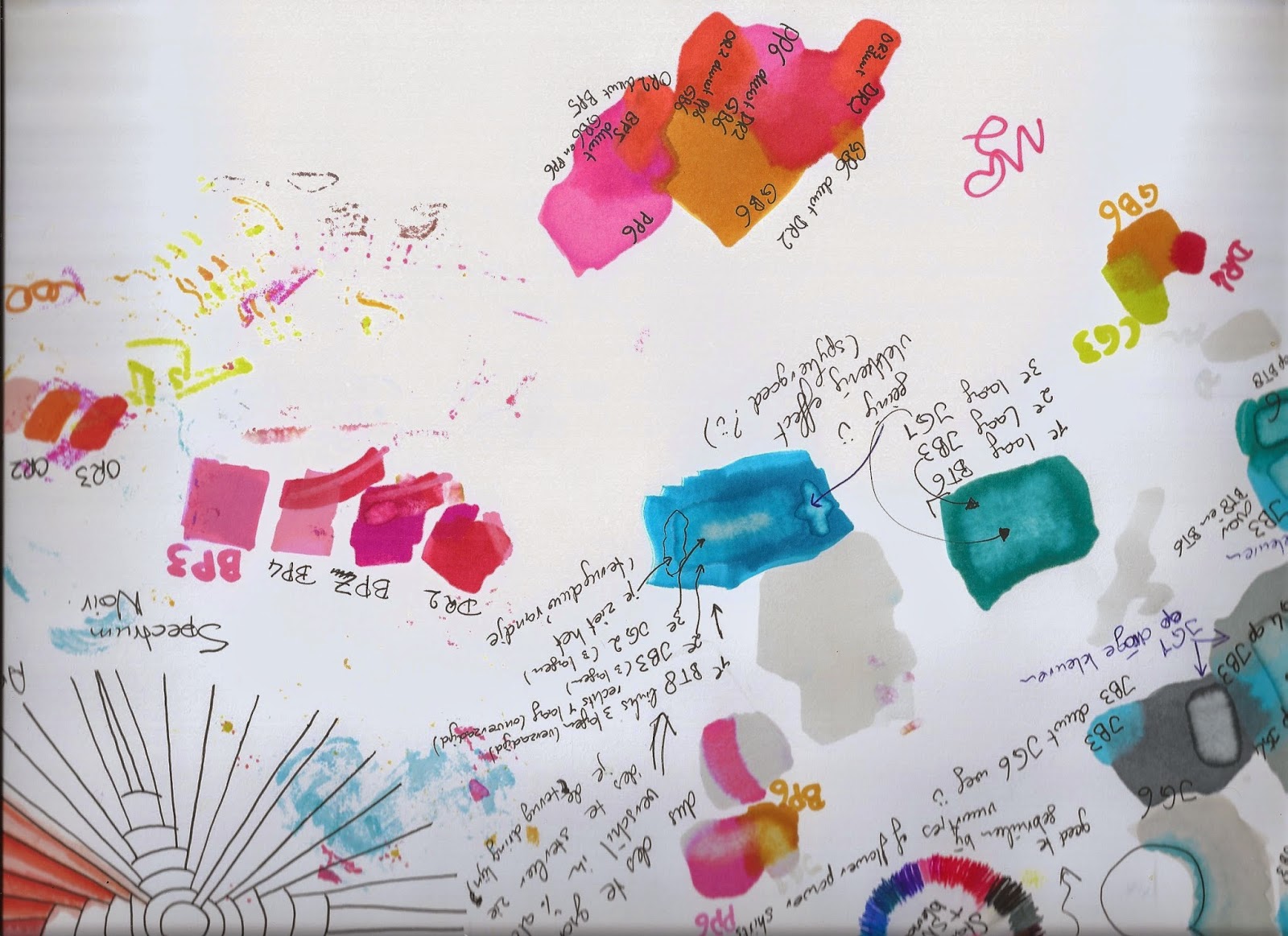 Na deze testen heb ik een andere eigenschap van de markers uitgeprobeerd op mijn grote goedkope aquarelblok (220 gr/m2). De basis van de markers is het oplosmiddel alcohol. In elke kleurgroep zitten verschillende tinten. Elke marker heeft een lettercode gevolgd door een nummer (1 tot en met 11 maximaal). Hoe hoger het nummer hoe donker de tint én hoe minder alcohol erin zit. De lagere nummers in elke groep bevatten dus meer alcohol. De blender is kleurloos dus daar zit alleen maar alcoholoplossing in. After these tests I tried another characteristic of the markers on my cheap and big aquarel paperblock (220 grams). The base of the markers is containing the solution alcohol. In each colourgroup there are several hues. Each marker is numbered (1 up to 11 at max). The higher the number the darker the hue is and that has lesser alcohol. The lower numbers contain more alcohol. The blender is colourless, so it is 'pure' alcohol solution.
Als je met de blender over een andere kleur gaat, duw je letterlijk de kleur door het papier heen waardoor het aan de voorzijde minder zichtbaar is. Zo kun je ook mooi foutjes, zoals het kleuren buiten de lijnen, mee wegwerken. Hoewel je dan wel heel vaak over het foutje heen moet 'stempelen' met de blokpunt. Het leuke is dat je dit goed kunt doen als de kleur ook geheel is opgedroogd. If you colour with the blender on top of another colour, you litterally push the colour through the paper and make the colour less visible on the front site. This way you can make mistakes, like colouring outside the lines, go away. For this you have to stamp with the chisel nib on the mistake several times. The fun thing is you can do this eventhough the colouring is already dry.
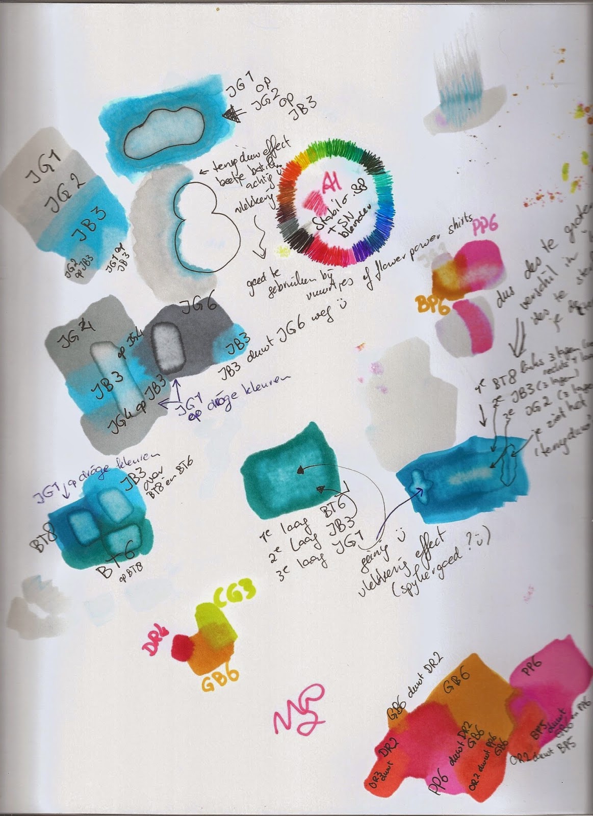
Het geinige is dat ook de lichtste kleuren dit effect geven. Je kunt zo een lichte kleur op een donkere kleur 'leggen'. Dit kan werkt als het opgedroogd is én als het nog vochtig is.
In de proef met het wolkje heb ik eerst de 2 blauwen verzadigd over elkaar heen gekleurd en daarna in de wolk-vorm de lichtste ijsgrijze (IG1) erover heen gekleurd. Het effect is leuk: vaag-vlekkerige lichte wolk in een blauwe omgeving.
Ook met de Goud Bruine 6 (GB6) ben ik over andere kleuren heen gegaan. Deze licht-okerkleur drukt ook heel veel andere kleuren weg. Geinig om hier proefjes mee te doen!
Another fun thing is even the lightest colours of each group can do this effect. In this way you can lay a lighter colour on top of a darker one. This works on dry and on wet coloured parts.
In the test with the cloud I first coloured two blues saturated on top of each other. After that I went over them with the lightest Ice Gray (IG1). The effect gives a vaguely spotted cloud in a blue surrounding.
I did the same with the Gold Brown 6 (GB6) on top of other bright colours. And on most of the colours it had the same effect. This yellow brown does press a lot of other colours through the paper. I think it's quite some fun to try this !
 Na deze proefjes ben ik natuurlijk ook op kleurplaten en op een getanglede tekening gaan kleuren. Het overlopen van markers binnen eenzelfde kleurgroep of juist via andere kleurgroepen heb ik lekker uit zitten proberen.
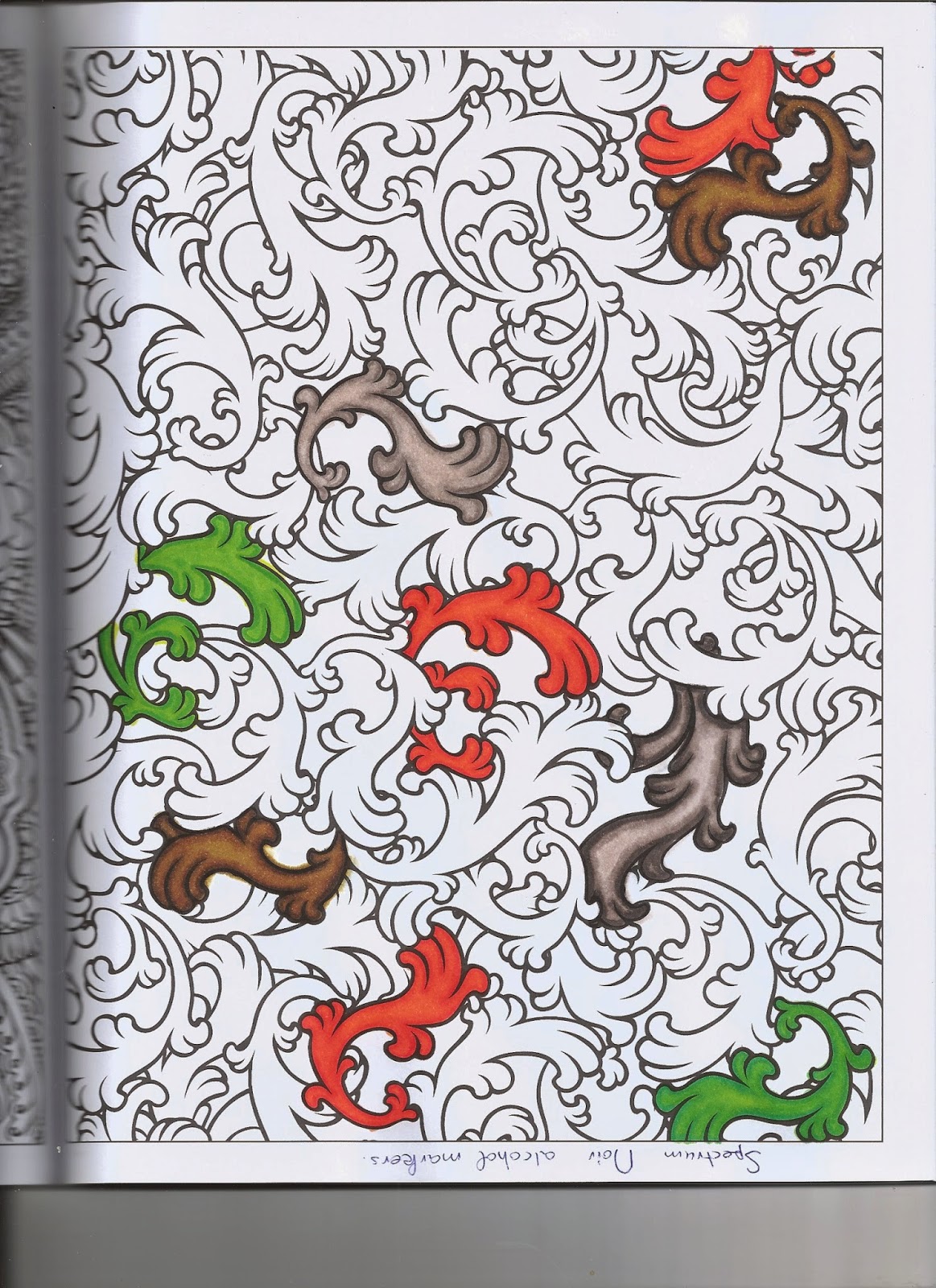
Dat de kleuren door het papier heen 'lekken' bij meerdere lagen, zie je bij de linker scan van de monotangle Arukas. Ik had de volgende kleurplaten op het papier van het grote blok gelegd en ... de gebruikte blauw drukte dus goed door. Sandra Strait maakt van dit effect zeer veel gebruik bij het maken van "Bleedthrumanades". Zie http://lifeimitatesdoodles.blogspot.nl/p/what-is-bleedthrumanade.html
After these tests I tried colouring on templates and on a tangled drawing, ofcourse. I freely practised the blending in one and between more colour groups.
That colours are 'leaking' through paper when you apply more than one layer, you can see on the left scan of the monotangle Arukas. I used this paper underneath other sheets of paper during colouring and the used blue is to be seen on this paper. Sandra Strait makes good use of this effect making "Bleedthrumamades". See http://lifeimitatesdoodles.blogspot.nl/p/what-is-bleedthrumanade.html
Op Facebook zag ik in de loop van de afgelopen weken ook een groep waar het kleuren met alcohol markers wordt geoefend : Kit and Clowder. De Australische dame heeft een webshop waar je cursussen online kunt kopen en bekijken. Ze geeft dan ook advies voor de betere toepassing van alcohol markers zoals Spectrum Noir en Copic's.
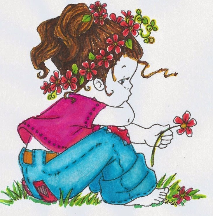
Alcohol markers worden veel gebruikt bij het inkleuren van gestempelde afdrukken voor het maken van kaarten. Ik heb dus veel 'gratis' (oeps, dus illegale) digitale stempels (of ook wel kleine kleurplaten ;-) ) gedownload en ben op kopieerpapier gaan zitten tekenen. Elk plaatje heb ik op een kwart van een A4 afgedrukt, dus de grootte is een A6 (maximaal 10 x 15 cm). Het kleuren binnen de lijnen moet ik ook nog iets meer gaan oefenen. De technieken zijn geinig om het 'in het echíe' te bekijken.
During a couple of weeks I noticed on Facebook a group where colouring with alcohol markers is practised: Kit and Clowder. The Australian lady has a webshop where you can buy online courses. She gives advice for better use of alcohol markers like Spectrum Noir and Copics.
Alcohol markers are widely used for colouring stamped prints to make cards. Therefor I downloaded many 'free' (so illegal) digital stamps (or you can say small templates ;-) ) and started colouring on A4 copierpaper. Each picture I printed on a quarter of an A4, so the size is A6 (at max 10 x 15 cms). Colouring between the lines I have to practise too. The see the techniques in real life is fun to do.
.jpg)
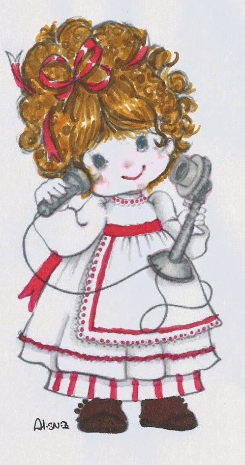.jpg) Hier zie je mijn resultaten. Helaas heb ik geen echte huidskleur-markers dus ik heb de gezichten maar wit gelaten. Je snapt vast wel dat ik deze kleuren op mijn verlanglijst zet voor mijn verjaardag in januari ;-)
Hier zie je mijn resultaten. Helaas heb ik geen echte huidskleur-markers dus ik heb de gezichten maar wit gelaten. Je snapt vast wel dat ik deze kleuren op mijn verlanglijst zet voor mijn verjaardag in januari ;-)Here are a few of my results. Unfortunately I do not have real skin tone markers, so I left the faces white. You probably will get that I put these colours on my birthday list coming Januari ;-)
.jpg)
groetjes greetings van Arja
Geen opmerkingen:
Een reactie posten